
The color of the material plays a key role in shaping the fashion trend. It is from choosing the fabric that the collection begins. The Pantone Institute has identified the main shades in the coming months. To wear them or not is up to you, but do not be surprised at the abundance of “shady spruce” and “neutral gray”, going to the store. Now you know where your legs grow.
Autumn Maple

A complex red shade of “autumn maple” (autumn maple) was blazing on many shows. Especially it is good when it comes to accessories or shoes. Bags, ankle boots and belts of a red shade seem to be neutral, but at the same time they set the image to a new level. Very cool “autumn maple” looks in the company with white color, as in the Céline show.
Ballet Slipper

A delicate pale pink color occurs in autumn-winter collections not very often, which is a bit offensive. Sweaters, wool trousers and cozy dresses in the shade of “ballet slippers” please the eye much more than a dreary black and gray palette.
Golden Lime

Greenery not only still retains the status of the key color of 2017, but also acquired a younger brother – a shade of “golden lime”. Color and truth are interesting, although not the easiest to handle. Wear it along with electric blue, saturated berry or terracotta shades. Neutral black or beige too will make friends with “lime”, which really becomes golden under certain lighting.
Navy Peony

A very beautiful, deep shade of blue, called “navy peony” – the most popular color of the autumn-winter season. With this, you can make a total bow, and integrate into the image as some kind of accessory. And he rhymes with almost any shades: at least with greenery, though with scarlet, even with black.
Butte Rum
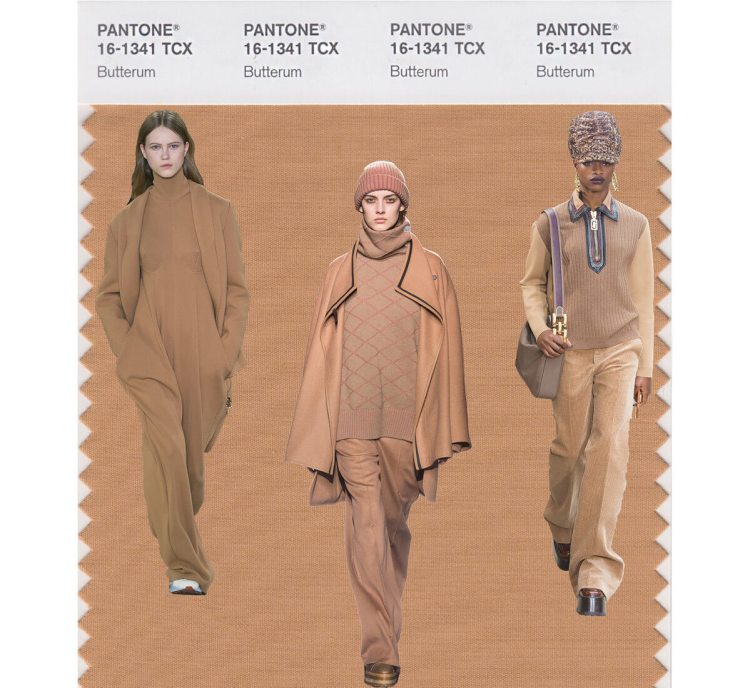
Warm sand color “oil with rum” – autumn fashionable classics. A coat of a man’s cut, cozy sweaters, wide trousers and dresses are almost the most beautiful that there are in new collections. In this color I want to dress up from head to toe, in fact, that’s exactly what designers are advising to do.
Marina

The shade of the “marina” is so bright that it seems as if the fabric is shining. In the new season there were many images completely made up of things of this color, but the most interesting “marina” looks as a detail. For example, in a company with brown or white flowers.
Neutral Gray
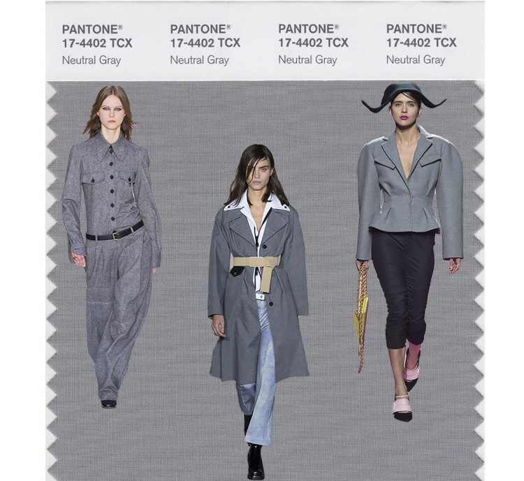
In this bright palette there should be at least one calm color. Pantone offers “neutral gray”, as an answer to the question – and with what all this combine? And, by the way, gray – does not mean boring. Just the same gray total-bow looks much more interesting and attractive than the images in dark tones with bright shades. One of the most beautiful combinations is a three-dimensional jacket of gray color and blue jeans.
Tawny Port

Violet-brown “tawny port” is similar to the shade of port. Difficult, interesting and not very whimsical. This is good both as an accent and as the main color of the image. Very creative with the “tawny port” cost creative director Valentino Pierpaolo Piccioli. The designer combined it with lemon, turquoise, brown, emerald and other complex shades.
Grenadine

If the soul very much asks for a holiday and salvation from autumn gray, then you definitely need a grenadine! And we’re not talking about cocktails, but about a rich red shade. This fall is to dress up in red from head to foot. If this approach seems too bold for you, then take note of the image from the display of Dries Van Noten: a bright suit in combination with a beige jumper and boots on a flat sole. In this you can come to study, and to work, and in the evening go out to have fun with friends.
Shady spruce

The shade with the sophisticated name “shady spruce” is something between dark green and the color of the sea wave. Deep, calm, even calming. Perfectly complements almost all the shades of blue, and still easily rhymes with lilac, purple and fuchsia.